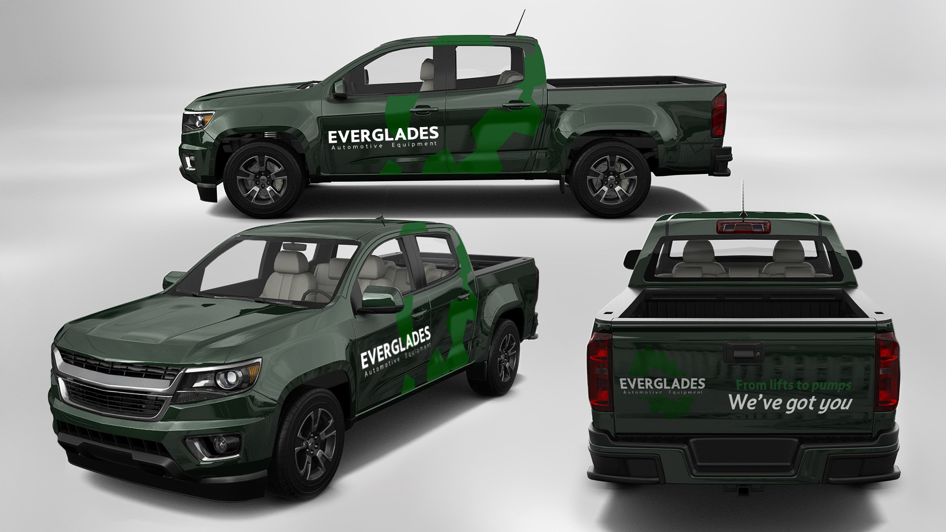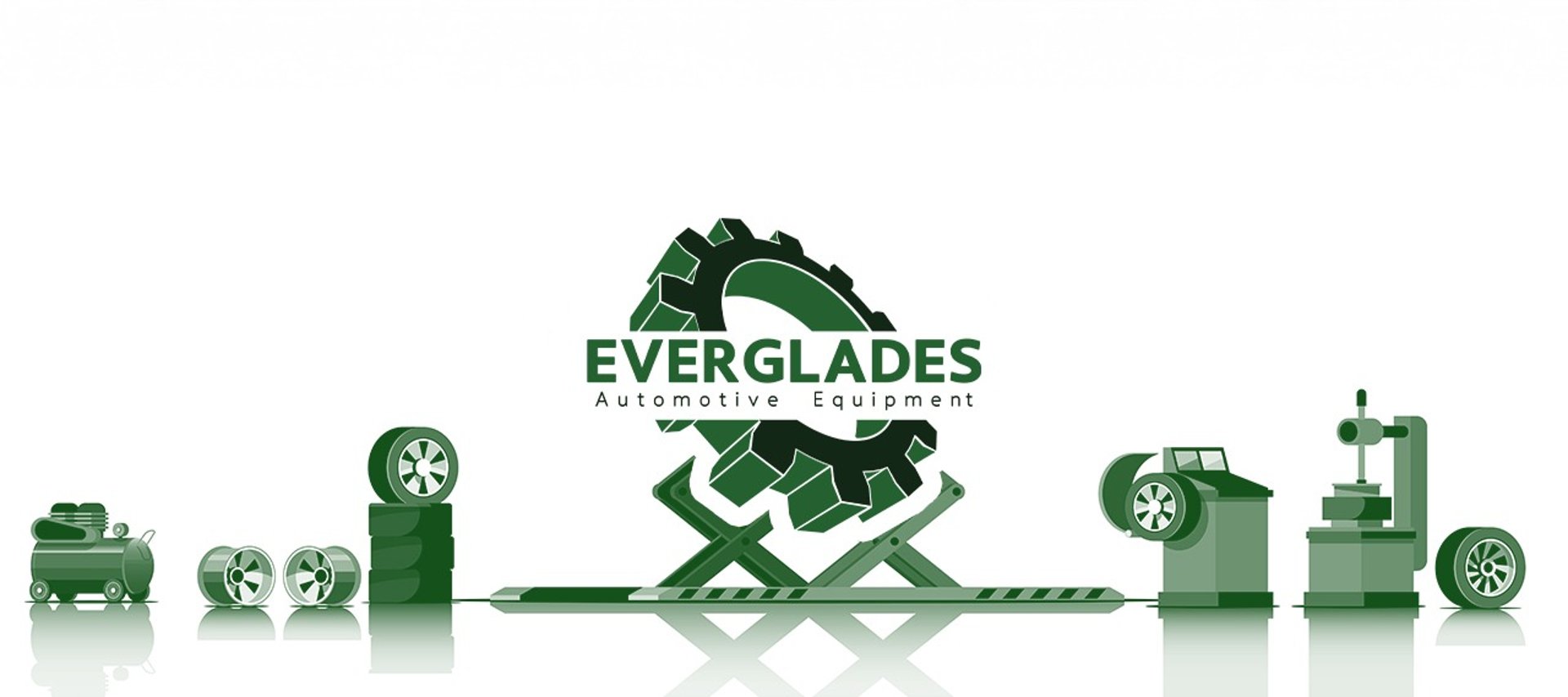
Everglades Automotive Equipment is a family-owned and operated small corporation specializing in the sales, service, and maintenance of mechanical shop equipment. As a newly established company, they needed a strong visual presence to stand out among competitors and connect with their target audience. Our task was to develop their visual identity, stationery, and marketing materials to establish a professional and recognizable brand.
Visual Identity


The owner had a clear vision and wanted a gear to be the brand’s defining element. Through collaboration and idea-sharing, we developed a concept that balanced minimalism with depth. This approach ensured the logo's versatility across various applications, both in print and digital formats. The subtle 3D effect added a distinctive touch, setting the brand apart from competitors who favored a more static design.
Concept


Since the company specializes in heavy equipment, a bold typeface was the natural choice to convey strength and reliability. To create balance and enhance readability, we paired it with a thinner typeface for the secondary line in the logo, adding a touch of contrast and sophistication. We used LT Asus in all its variants for brand development, establishing it as the company's corporate typography.
Typography
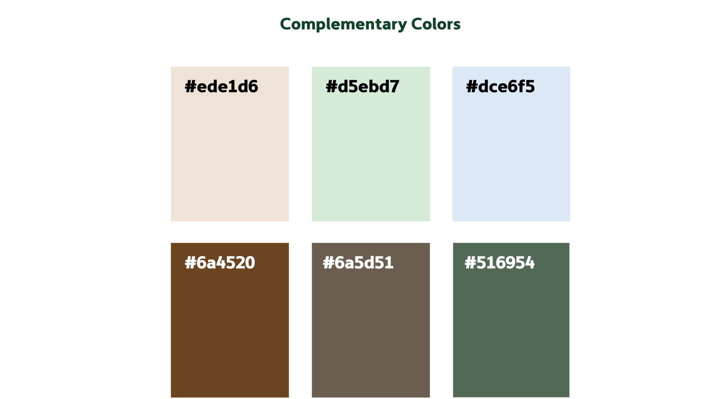
The client was set on using green as the brand’s primary color—a nod to the company’s connection to the Everglades region in Florida. This decision proved both meaningful and strategic. In a landscape where competitors predominantly use red, orange, or blue, green allowed the brand to carve out a unique visual space. We explored a range of green tones, maintaining low lightness levels to reinforce a sense of durability and professionalism while staying aligned with the company's identity and industry.
Colors