Final Project from the Course: UI Development
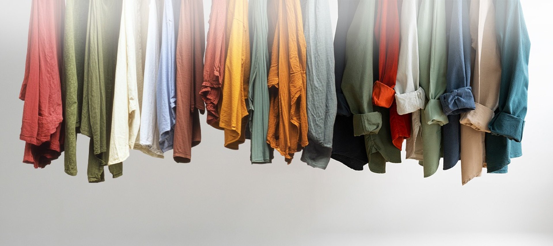
Oncycle is a brand new, environmentally friendly clothing company. The goal of the project was to create a unique visual identity and an easy to identify brand. Along with a user-friendly, visually appealing, and responsive website that enhances the shopping experience. The design brief emphasized a mobile-first approach, streamlined navigation, and clear categorization of products.
Naming, Visual Identity, Website
In Oncycle nothing is created, nothing is lost, everything changes.
As soon as I finished reading the brief, one quote immediately came to mind—Antoine-Laurent Lavoisier’s famous words:
"In nature, nothing is created, nothing is lost, everything changes."
This idea perfectly encapsulated the company’s vision.
With this in mind, I saw recycling as a continuous process, an almost infinite cycle. Almost.
Then, in a spark of creativity, the name Oncycle came to me. I explored other options, but this one felt just right. Without needing an explanation, it immediately conveyed the essence of an environmentally friendly company.
Naming and Concept
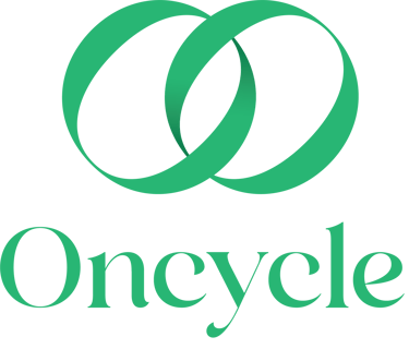
I then sought an elegant typography that would define the brand’s identity. The Andora Modern Serif font is a refined and sophisticated typeface that blends classic elegance with contemporary design. Its high contrast between thick and thin strokes adds a touch of luxury, while the soft, flowing curves create a modern yet timeless feel.
By slightly rotating the letter "O" and duplicating it, we created a symbol that visually represents this almost infinite cycle.
Oncycle is primarily represented by Andora Modern Serif, which is used in the logo and later incorporated into select artistic headlines. This elegant serif is complemented by Louis George Cafe, a modern, geometric sans-serif font that adds a refined touch. Its clean design ensures readability, especially on screens, where the company maintains its primary presence.
Typography
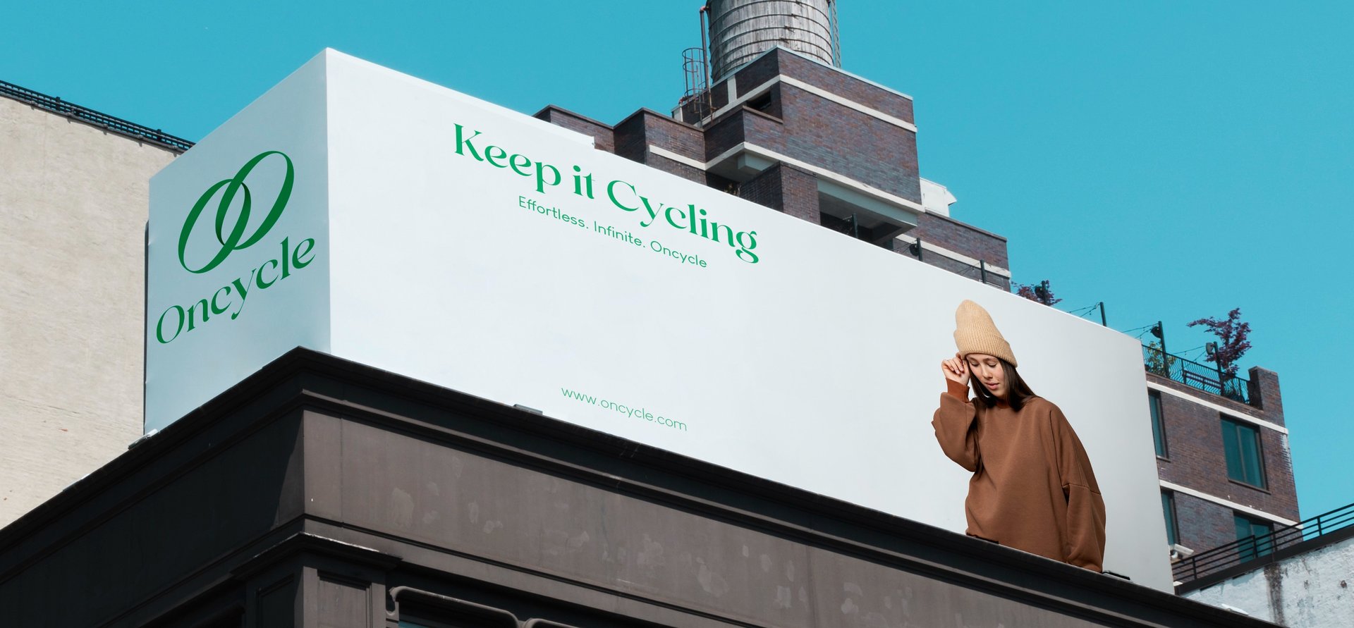
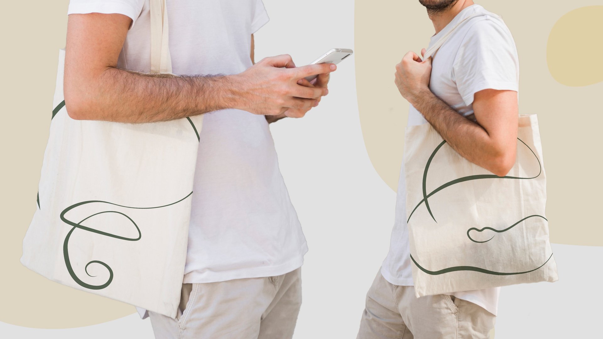
Recycling doesn’t mean less valuable, so we embraced the color that symbolizes this commitment. A light green serves as the face of the company, complemented by deeper green shades to add depth and strength.
Colors
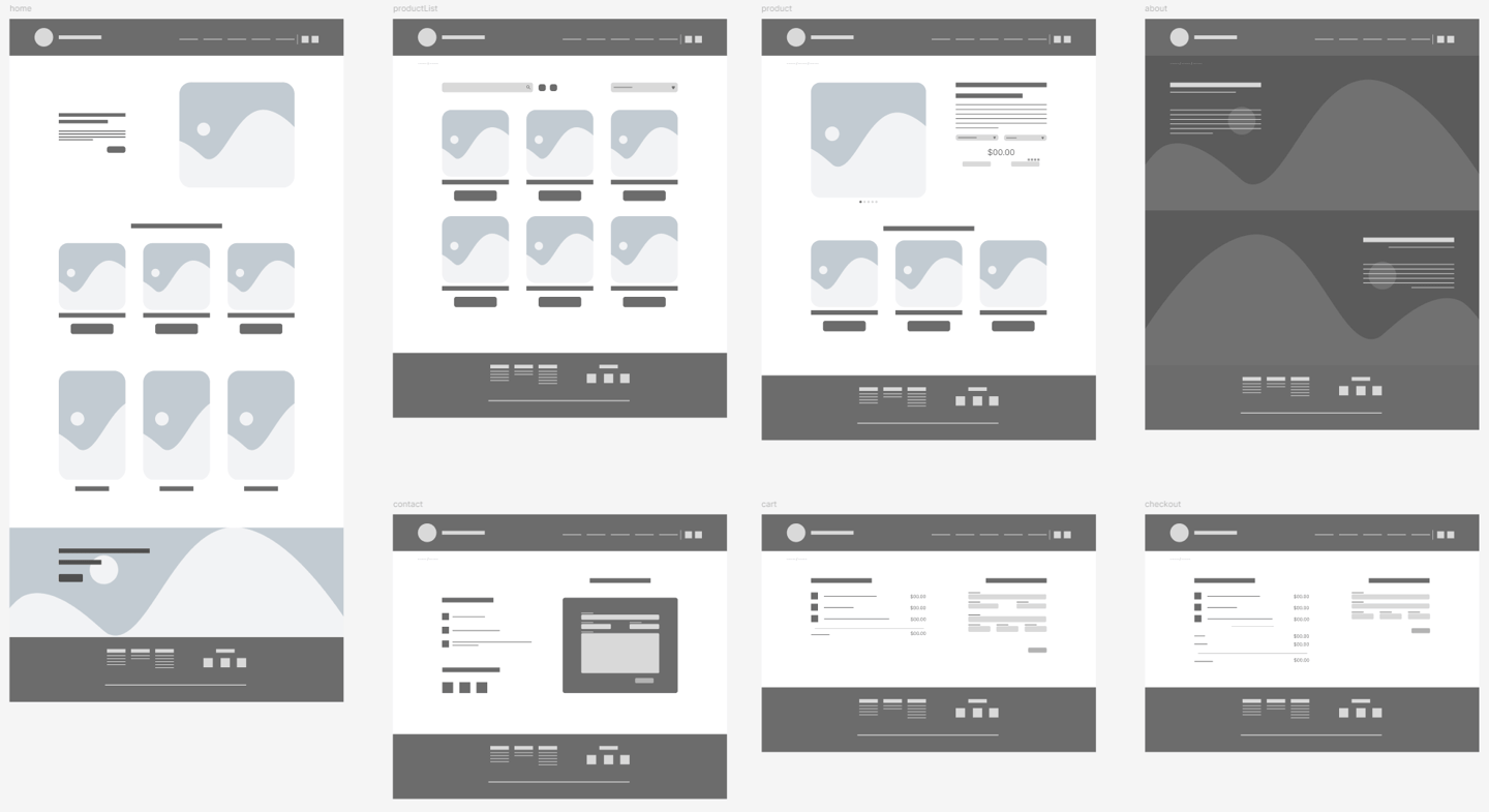
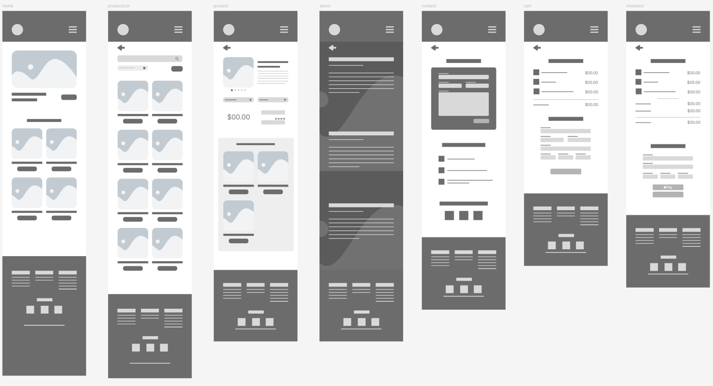
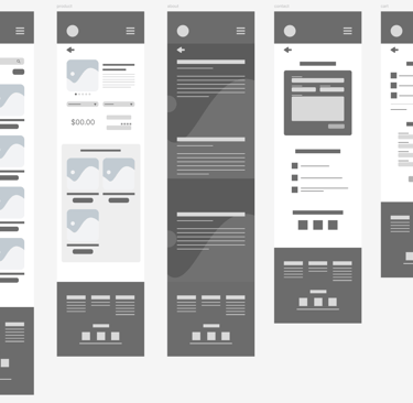
Wireframes helped outline the basic structure of the site. These wireframes were instrumental in testing the layout before moving into high-fidelity designs. The mobile-first approach ensured that all key functions could be accessed smoothly on small screens.
Wireframes
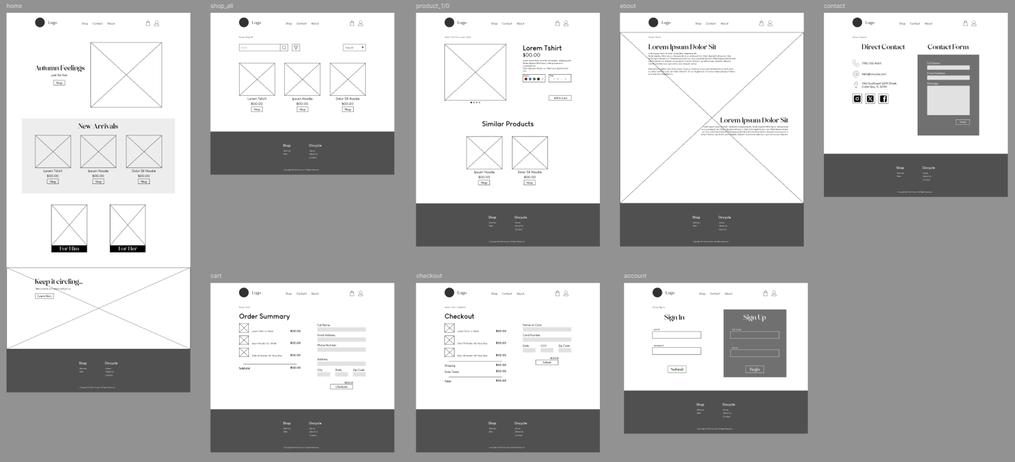
Desktop
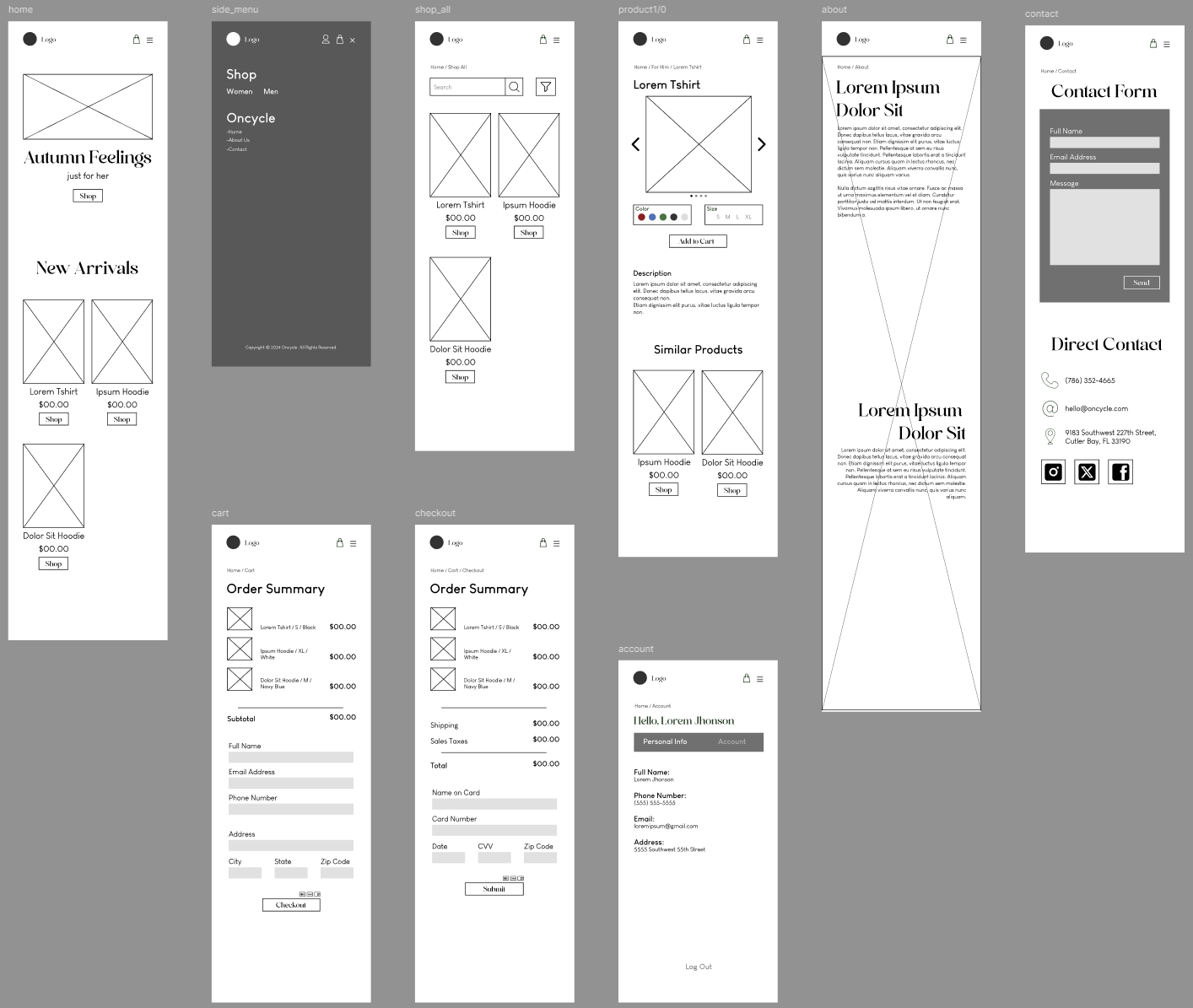
Mobile
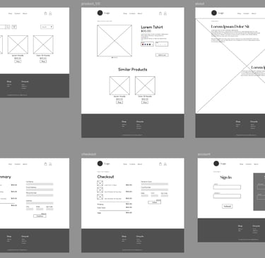
Low-fidelity prototypes were developed based on the wireframes. These were a quick but fully funcitonal version. Not applying asthetics so the main focus was usability.
Low Fidelity Prototype
Desktop
Mobile
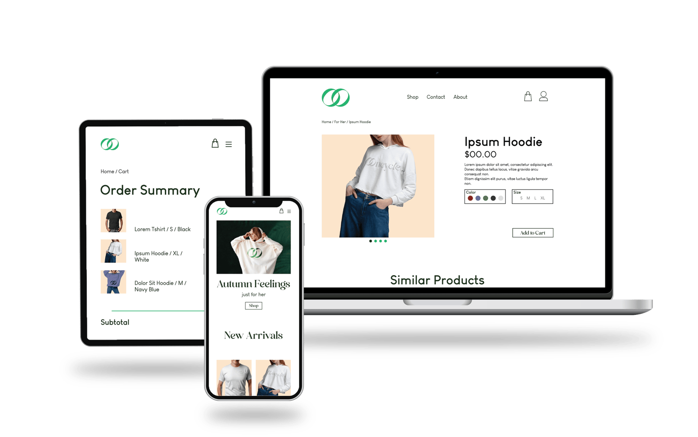
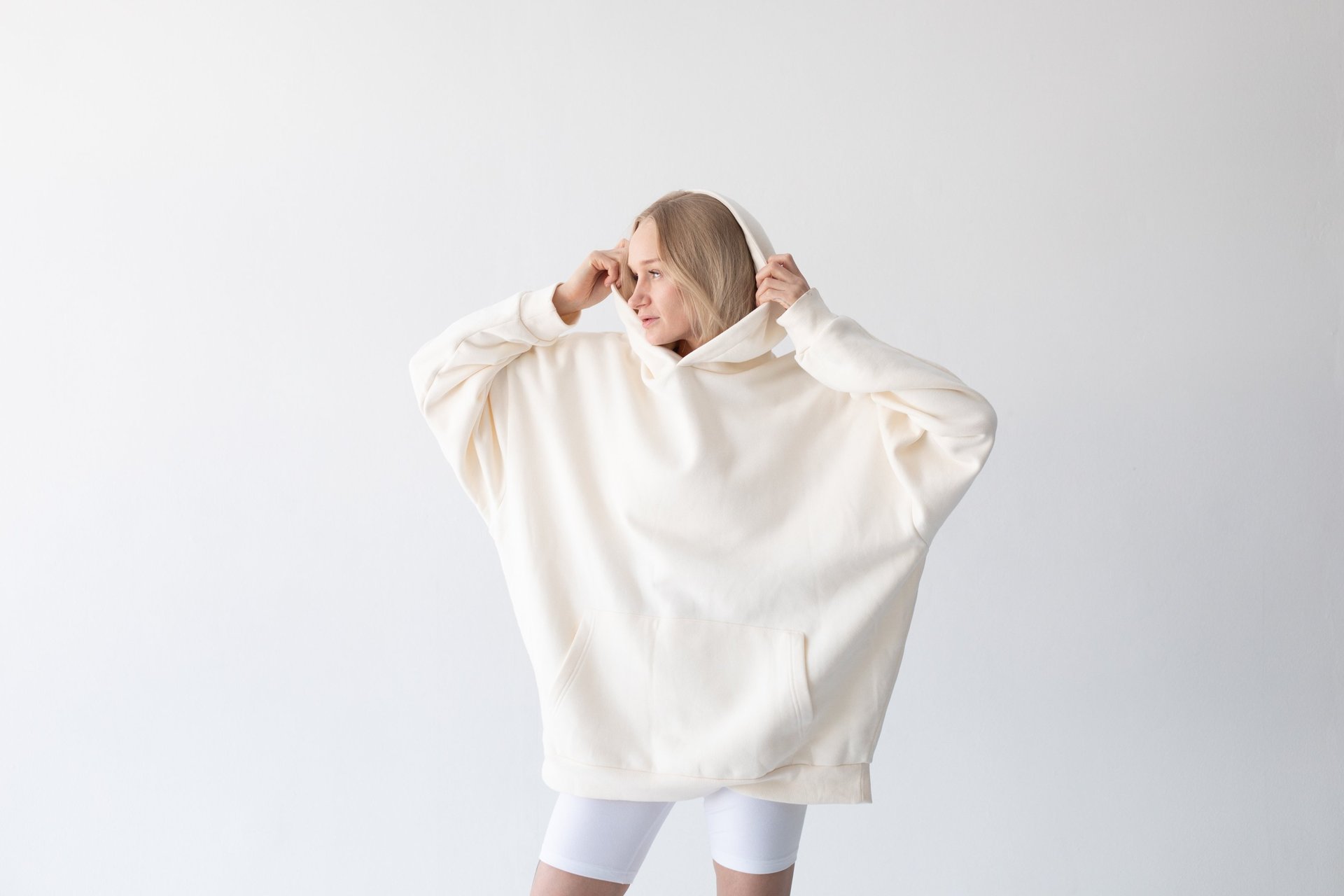
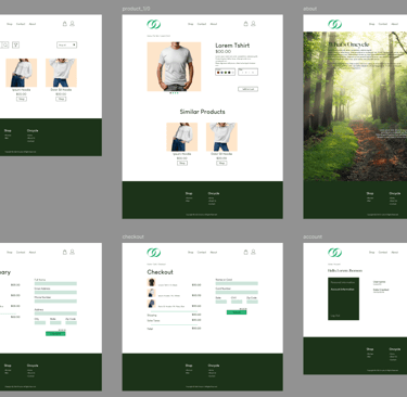
The final product was achieved after putting the high-fidelity prototype to the test thrpugh a Live User Test. It reflects a polished, user-friendly e-commerce platform. Key features include a streamlined shopping experience, optimized mobile layouts, and visually appealing product displays. The website was designed to balance aesthetic appeal with functional ease, ensuring users can browse and buy products effortlessly.
High Fidelity Prototype
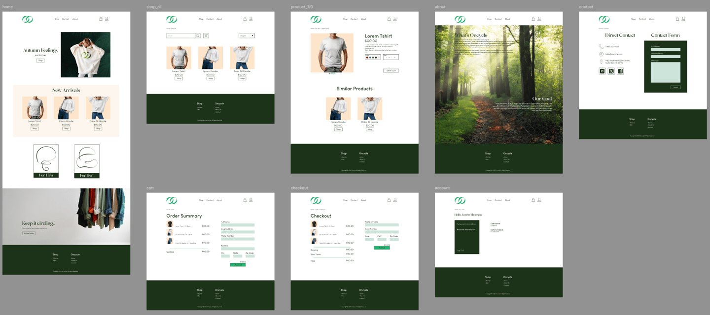
Desktop
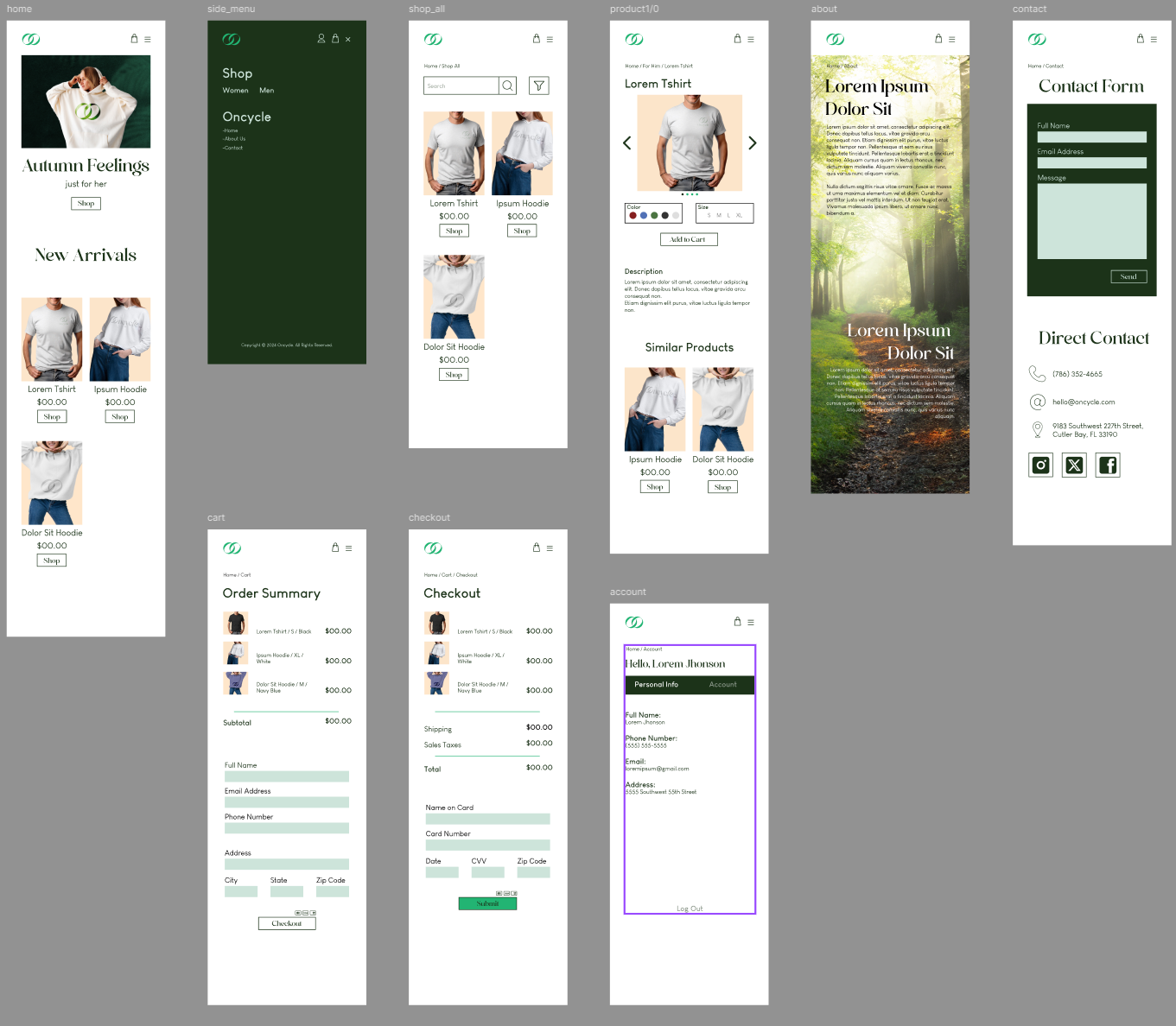
Mobile