

Final Project from the Course: UI Development
UrbanThreads offers a diverse range of t-shirts, sweaters, and hoodies featuring distinctive designs that embody a rebel attitude, open-mindedness, free will, and creative thinking. For this project we developed its visual identity, business card, letterhead and promotional flyer.
Visual Identity, Marketing Materials
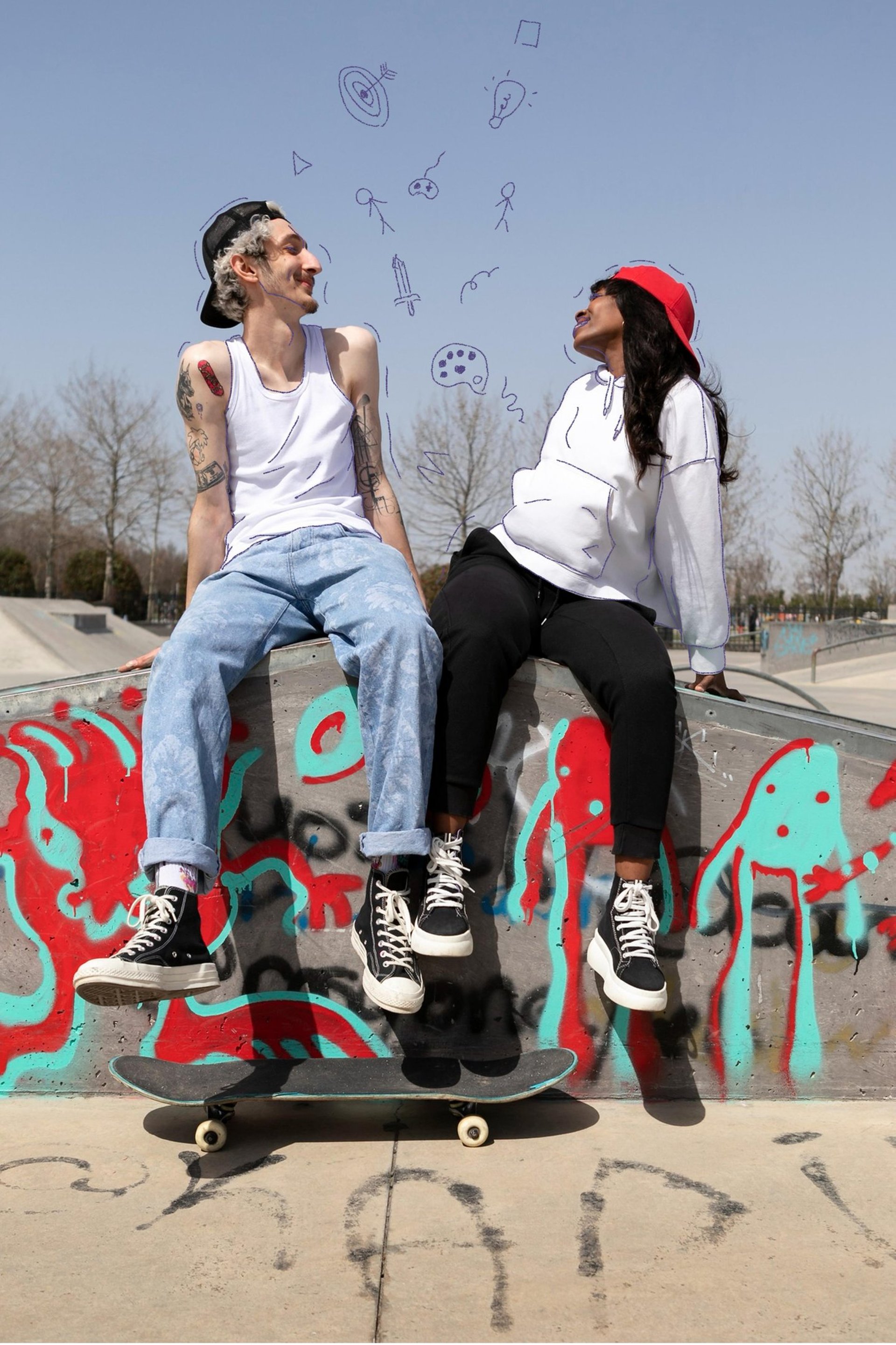
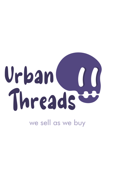
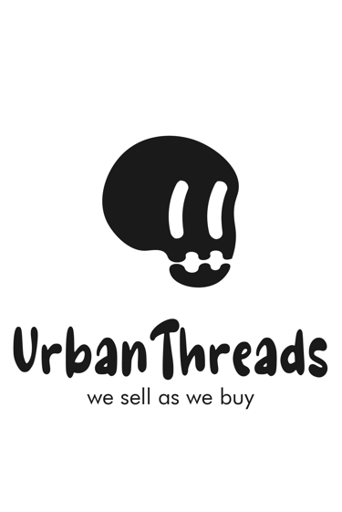
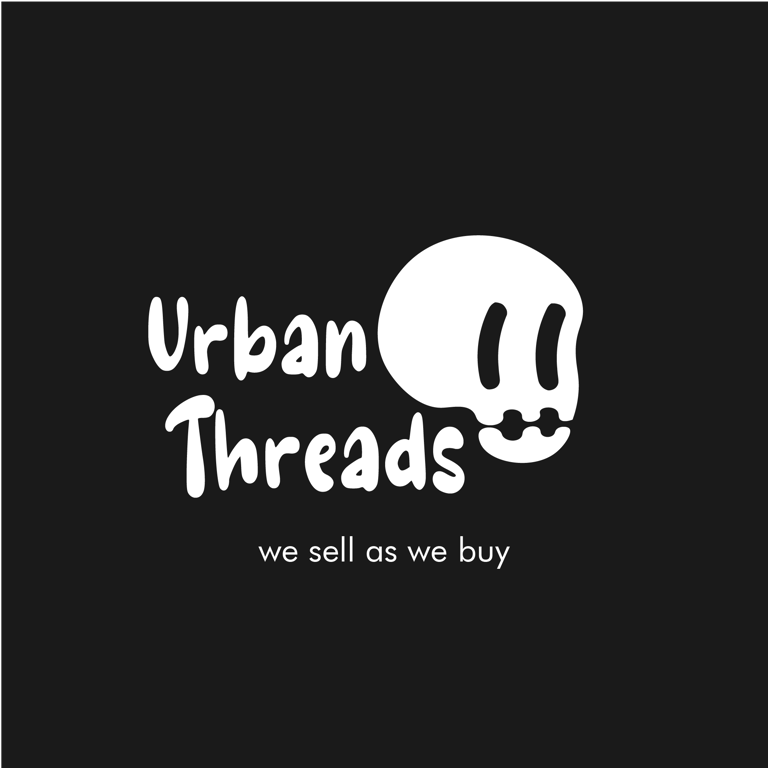
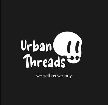
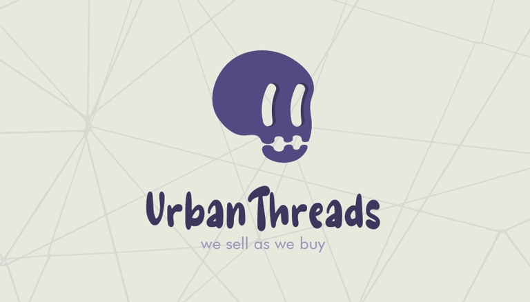
The name was already decided and we wanted to look for a non-obvious way to represent it. After many sketches we came up with this skull drawn in a rubber hose style, finding a balance between a serious brand and rebelness.
Concept


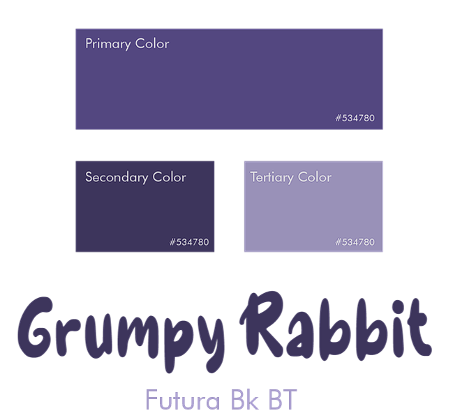
Our color pallete is simple. It maintains a purple hue but changes its brightness and saturation for the Secondary and Tertiary colors. We chose a purple skull to convey a sense of edginess, rebellion, or individuality. It might appeal to people who identify with alternative or subculture aesthetics. The color purple adds an element of mystery and creativity.
For our wordmark we used GrumpyRabbit, a hand-draw typography with a cartoon and playful style. And for the tagline we used Futura Bk BT, a sans serif font to differentiate from the wordmark and to be easily readable.
Colors & Typographies


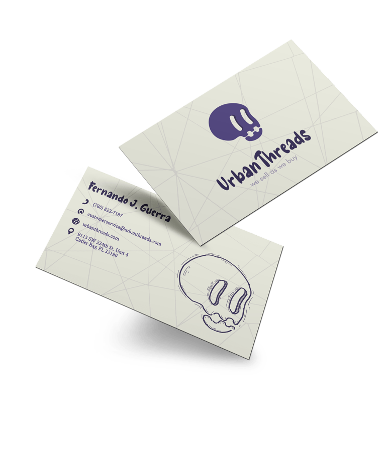
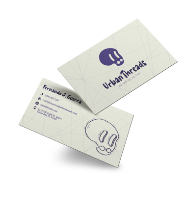
In the front of our card we present the primary logo with its tagline over a desaturated and bright yellow. We also took some actual threads and placed them in the back as a sense of unity and connection.
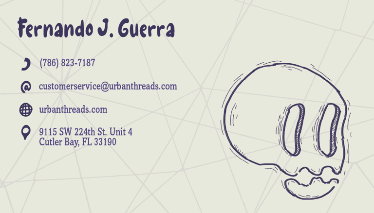
In the back we maintain the same background and threads. We added a contact name and contact methods as the phone number, email, website and address. Each of these have his own icon with the same style as the logo. To counterbalance the elements on the left we added a hand-drawn, not vectorized version of our logo in the right. This element also describes perfectly what this brand is about.
Business Card

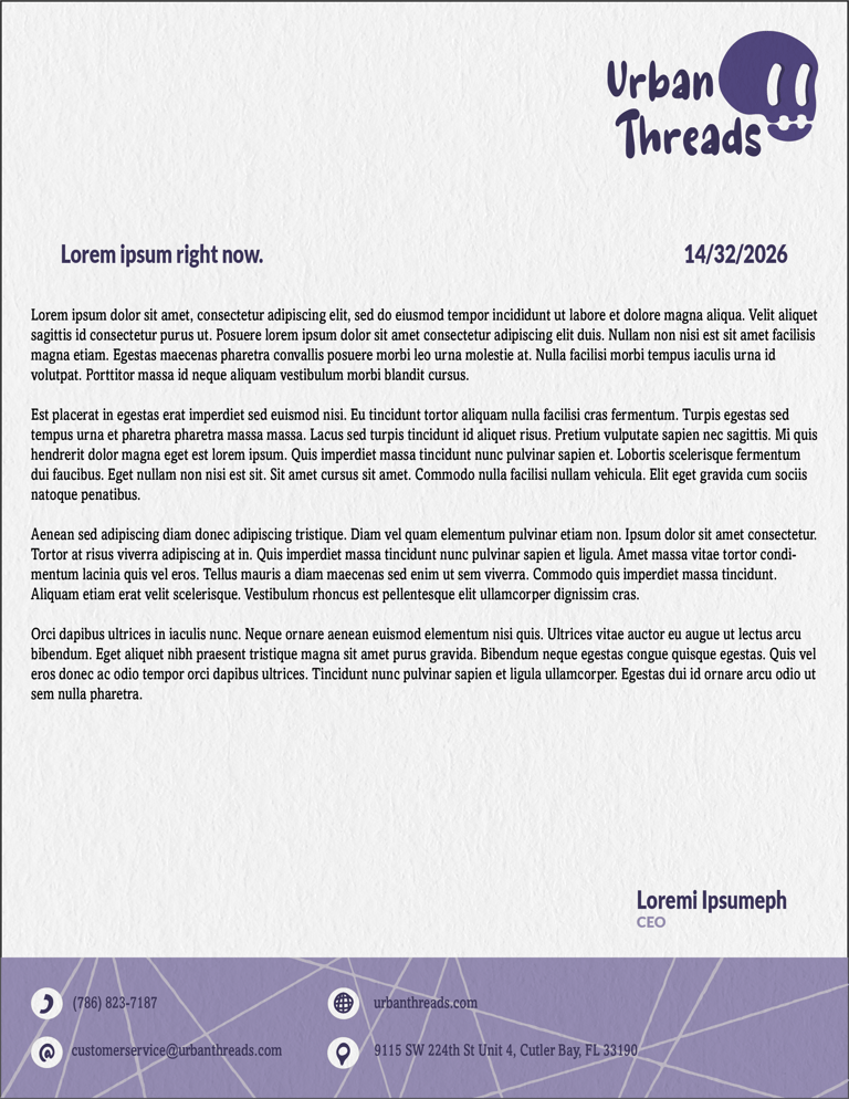
Letterhead
Letterheads have a lot of uses, so we had to balance the cartoon and playful style of our brand with the topics that may be discussed in this document. Our logo on the top right corner.Then a space in the middle of the page for the topic, date, content and signature, using the fonts designated fot this purpose. And at the bottom, contact information, using the same set of icons previously used. A light purple background with our unifier threads.
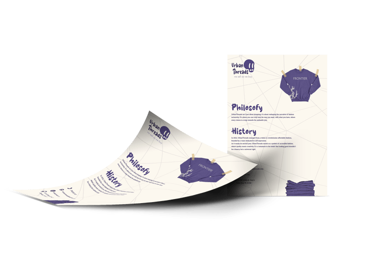
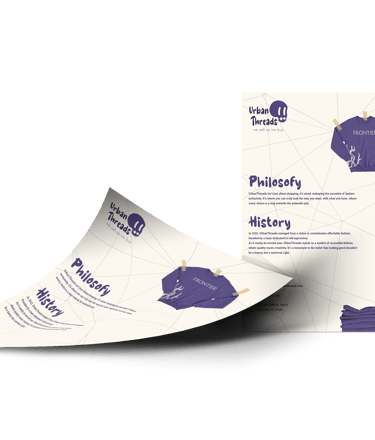
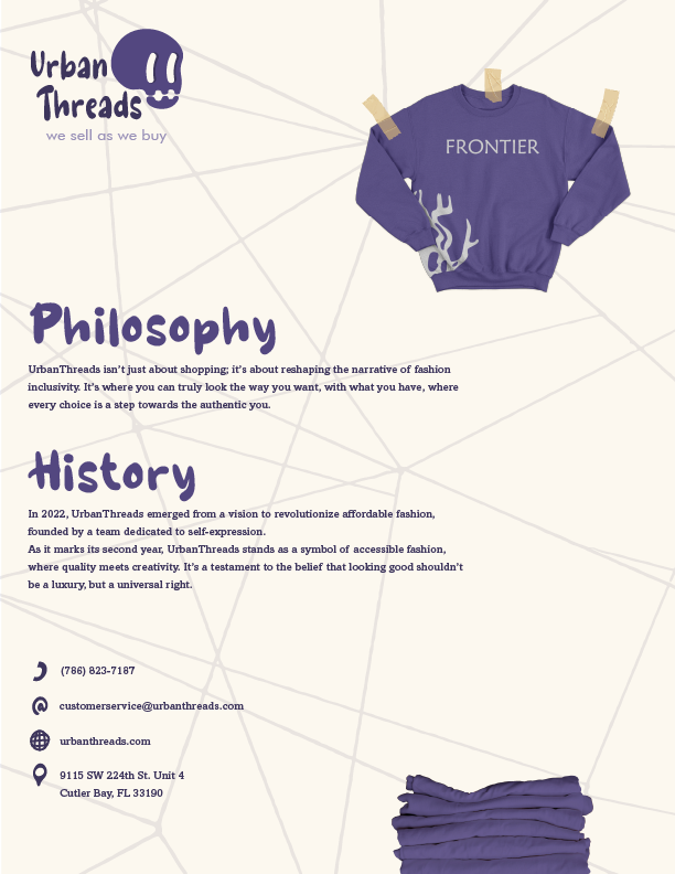
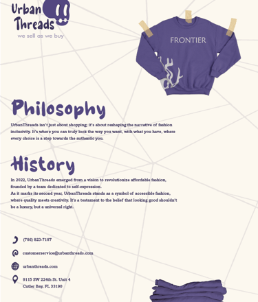
This piece was developed to let people know about our brand. We used the same background as in our business card. Our secondary logo in the top left corner, since that’s the place where our eyes go first. Following that path, we find a sweatshirt with one of our first designs “Frontier”, clrearly showing what our brand is about. Then we have brief versions of our philosophy and History. Summarizing our brand in short sentences, so the reader doesn’t get bored. Under that , we find our contact information with the icons. And finally, in the bottom right corner there’s a group of folded clothes, Re-emphasizing our products.
Promotional Flyer